We are celebrating seven years of inspiration and every week leading up a our Anniversary Celebration on July 22nd, we are going to inspire you with a new list of 7 things to help boost sales! This week we are reviewing the 7 Top Colors:
1. Greenery (Pantone Color of the Year)
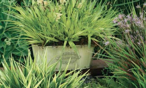
Bringing forth a refreshing take, Greenery is a tangy yellow-green that speaks to our need to explore, experiment and reinvent. Illustrative of flourishing foliage, the fertile attributes of Greenery signals one to take a deep breath, oxygenate and reinvigorate.
2. Dusky Blue
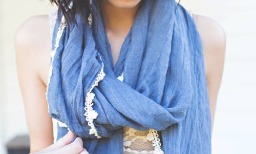
Comfortable and dependable, Dusky Blue is one of the most prevalent color for spring 2017. Dusky Blue is a classic denim-like blue that speaks to our desire for ease and relaxation.
3. Blue-Green
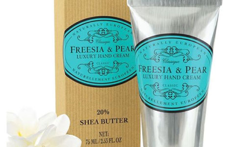
Blue-Green is a refreshing aqua that calls to mind a change of scenery. A cool blue green shade that speaks to our dream of the great escape, Blue-Green is emblematic of tropical settings and our desire to unwind.
4. Sunshine Yellow
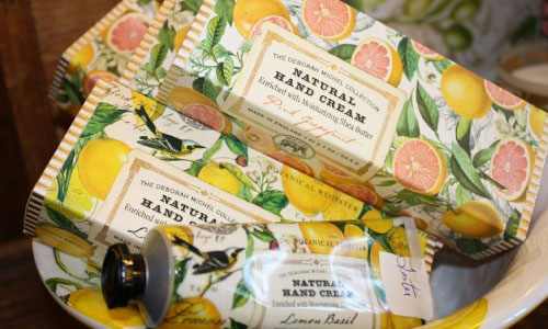
Sunshine Yellow sparkles with heat and vitality. Inviting us into its instant warmth, this joyful yellow shade takes us to a destination marked by enthusiasm, good cheer and sunny days
5. Mineral Gray
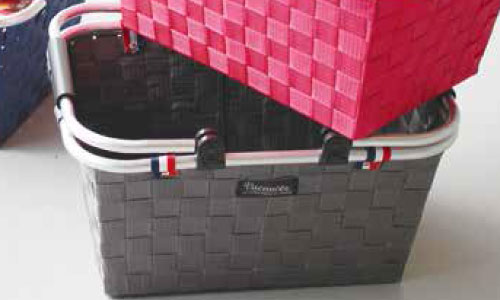
Color in material design is inspired by bold hues juxtaposed with muted environments, deep shadows, and bright highlights. Mineral grey is a muted tone that is direct contrast with most of the light colors on the list.
6. Light Blue-Green
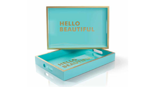
Light Blue-Green is associated with meanings of refreshing, feminine, calming, sophisticated, energy, wisdom, serenity, wholeness, creativity, emotional balance, good luck, spiritual grounding, friendship, love, joy, tranquility, patience, intuition, and loyalty.
7. Taupe Beige
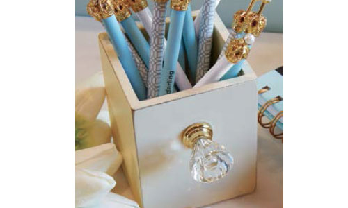
Continuing the tranquil mood, Taupe Beige is a quiet and peaceful pink shade that engenders an aura of innocence and purity. The unobtrusive Taupe Beige is a subtle pink whose soft touch infuses a healthy glow.
Sources: Pantone, Sherwin Williams, Material.io
